ShopDreamUp AI ArtDreamUp

Deviation Actions


Suggested Deviants


Suggested Collections


You Might Like…


Featured in Groups


Description
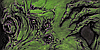
Our blind personal views.
Of what is good or evil.
Points of perspective.
Blind faith is not only a great shield but it is also a great sword which both can be wielded to great effect from each side of morality.
This is my entry for the Bring your Vision to Life contest.
The Theme was Good Vs Evil.
PS CS4/ Intous 3
Roughly about 15 to 17 hours.
Thanks to Purity 17 by ~magickstock
For here stock photo which I used for a loose reference where I work by eye. [link]
Don't forget to so I have a chance to win.
Hope you all like it.
Edit: Did some touch ups using some new Brushes courtesy of [link]
Of what is good or evil.
Points of perspective.
Blind faith is not only a great shield but it is also a great sword which both can be wielded to great effect from each side of morality.
This is my entry for the Bring your Vision to Life contest.
The Theme was Good Vs Evil.
PS CS4/ Intous 3
Roughly about 15 to 17 hours.
Thanks to Purity 17 by ~magickstock
For here stock photo which I used for a loose reference where I work by eye. [link]
Don't forget to
Hope you all like it.
Edit: Did some touch ups using some new Brushes courtesy of
[link]Image size
1388x950px 809.01 KB
© 2009 - 2024 Ito-Saith-Webb
Comments71
Join the community to add your comment. Already a deviant? Log In
I think the image is an interesting approach to the theme of the contest.
I think it is a very beautiful image, and definitely one of your best works so far. I really love the background, it looks gorgeous and very realistic.
Your work on the sea monster is great too, the tentacles look a little metallic at some points (maybe too much light?).
Are the red dots his eyes? I am a little unsure about the design of the monster, it is drawn realistically and great and all, but I can't really figure out its anatomy.
I love the work on the girl, she is very pretty, but she doesn't fit in 100%, I think it is because of the light (she is a little too lighted).
I really like the interpretation, how she gives herself to the monster in blind faith, but then again I am a pessimist, so I think the monster will abuse her faith.
Well done overall!